Highlights:
- Android users experience a bold and sweeping redesign in the Google Phone app with the launch of Google’s new Material 3 Expressive interface.
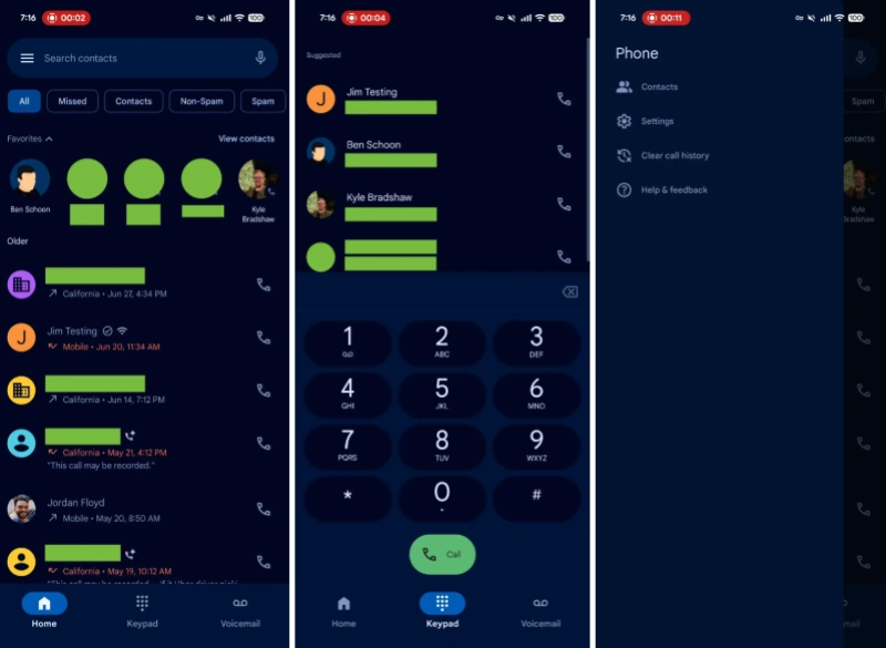
- The app will now feature three primary tabs: the Home tab, the Keypad tab, and the Voicemail tab.
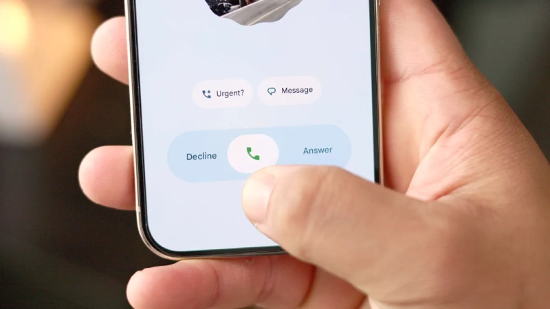
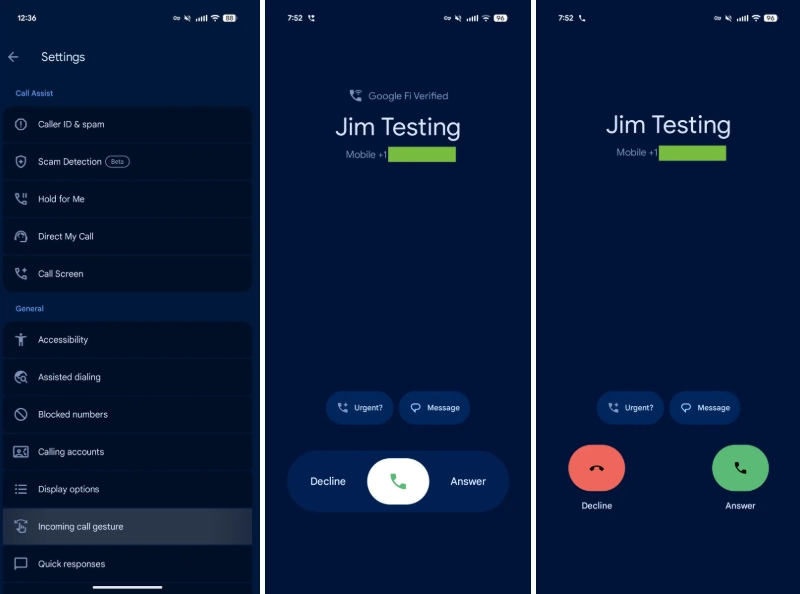
- One of the most celebrated additions is the new Incoming call gesture.
- The in-call interface has received a soft visual upgrade.
Android users experience a bold and sweeping redesign in the Google Phone app with the launch of Google’s new Material 3 Expressive interface. The update revamps both the visual language and the navigation structure of the app, starting with testing in June and arriving broadly with version 186 for stable users.
A Cleaner and More Focused Tab Structure
The app will now feature three primary tabs: the Home tab, the Keypad tab, and the Voicemail tab. The previous Favorites and Recents tabs have been merged into the new Home tab, where starred contacts are displayed prominently in a carousel at the top of the call log. Users have reported that this consolidation has helped reduce clutter and made frequent contacts more accessible; however, some users miss the old tab distinction.

Intuitive Gestures
One of the most celebrated additions is the new Incoming call gesture. This lets users answer or decline calls with a horizontal swipe or a single tap. This feature is customisable in settings and addresses the frustration of accidental call answer or declines when someone is pulling the phone out of their pocket. Many users have described it as a “pocket saver,” though some report a brief adjustment period before the gesture felt natural.
Redesigned In-Call Experience
The in-call interface has received a soft visual upgrade. The pill-shaped control buttons now morph into rounded rectangles upon selection, and the end-call button has been made larger. These controls have been appreciated by many, especially in low-light conditions or when a quick glance is required. A handful of users have commented that these shapes sometimes lack visual contrast, especially in darker themes.

Contacts and Settings Moved
Contacts are now present in a navigation drawer accessible from the search bar. This update streamlines the main interface. This has received mixed reactions. Some users welcome the streamlined look while others miss having the one-tap access to their full contact list.
Visual Overhaul
The Phone app is now enclosed within containers consistent with Material 3 Expressive standards, lists, and elements. This created a more elevated and layered look. The rounded number pad sheet replaces the old floating action button. Most users embrace this lighter and more modular approach, noting that it gives a more cohesive look with other updated Google apps. A minority feels that the added visual depth increases the fragmented layout.

The Positive Feedback
The users praised the gesture-based call controls for preventing unintended actions. The redesigned UI, with clear tabs, larger buttons, and containers, gives a modern and clean look to many, especially when juggling multiple tasks simultaneously.
The Negative Feedback
Other users miss the quick access to Contacts via its own persistent tab. A few express that the increased visual layers feel too cluttered on smaller screens. Others mention a slight learning curve adjusting to the new gestures and navigation changes.
A Cohesive Design Ecosystem
The redesign of Google’s phone is not happening in isolation. It is part of a broader rollout of the Material 3 Expressive across the Google App’s ecosystem. The apps, such as Contacts, Messages, Calendar, and Drive, are receiving updates that emphasize similar designs, including pill-shaped buttons and dynamic color themes. Users will now receive a more unified and fluid experience across the board.
