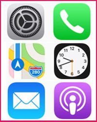
People around the world are using smartphones more than ever for everyday tasks. On average, a user spends around five hours a day on a smartphone. The majority of the time is consumed using applications.
Android and iOS are the most used operating systems for smartphones, accounting for 99% share of the smartphone market, according to Gartner. Hence, all the ideas about designing native mobile apps focus on Android and iOS.
While designing a user interface (UI) for iOS and Android apps, every designer should keep in mind the differences and similarities between the two platforms. Whether you are updating designs for an already published app or starting from scratch, this guide will help you design native iOS and Android apps efficiently.
Table of Contents
App icons
The icon of an app presents the first impression of the brand to the user.
There are certain icon guidelines for both Android and iOS which you need to follow as a designer. The app icons for iOS should have a flat style and skeuomorphism. All the iOS apps have the same shape for icons – square with round corners. The icon should be opaque which doesn’t clutter the background. Further, keep the background simple and avoid transparency.
iOS suggests that the icon should have a single, central point that can grab the attention and helps users identify the app.
You should always keep one thing in mind: never use replicas of Apple hardware products as they are copyrighted.
On the other hand, Android allows you to choose from a range of colors and paper shadows. For expressing a shared visual language, the graphic elements of the icon should have consistency.

Unlike iOS, you can use a transparent background for Android app icons and use any shape as per your choice. For the elements used on the icon, avoid the use of too many layers, because more layers can complicate the icon. Also, while overlapping the elements on the icon, you shouldn’t overlap more than two elements, as it doesn’t provide a clear focal point.
You should keep the icon elements in their geometric form, rather than skewing, rotating, bowing, warping or bending them.
Navigation
Navigation, the process of moving between various screens, helps users complete the tasks. It connects the screens by relating the elements to one another.
Navigation in iOS apps should make use of the tab bar, whereas Android apps can use tabs as well as drawer menu as main navigation components.

Not many Android apps use the bottom navigation bar, but the Material guidelines allow it. Some well-known Android apps use this navigation. For example, Instagram and Foursquare. For main actions of a screen, such as posting a new tweet or adding a new item, the iOS allows the use of a button which is generally placed on the right side of the navigation bar. Whereas, on Android, a floating button is used. Android app navigation comes with three buttons (back, home and overview), which can be physical or virtual, as per the device.
iOS, on the other hand, has only one physical home button for navigation and back button inside the apps. The Android users can use those buttons to go back whenever they want without depending on the back button inside the app.
Typography
Both iOS and Android Material encourage designers to use the default fonts in the app.
The default font for iOS is San Francisco (SF) which is optimized to enhance the text clarity and consistency. The font weight, size, and color can be used to highlight key info in the app.
The iOS will automatically apply the right variant according to the point size and use accessibility settings when the San Francisco fonts are used for standard controls such as buttons and labels. Use of SF Pro Text for text 19 points or smaller and SF Pro Display for text 20 points or larger are most appropriate for interface mockups.
On the other hand, default fonts for Android are Roboto and Noto for languages not included by Roboto. You can choose expressive fonts for headlines which attract users. Google suggests Serif or sans serif for headlines. Avoid the use of expressive fonts like handwritten or script styles for text in the body copy.
A noteworthy thing for designers is to not use a mix of several different typefaces which can make the app look sloppy and fragmented. While both iOS and Android allow the use of custom typefaces, but their use should be limited as they are often difficult to read. Custom fonts should be used only if the app needs it for branding purposes.
Grid
The grids are used to show multiple items in a 2-D scrollable view in the apps. The sizes, paddings, and spaces of the grids and fonts used on them should have consistency everywhere.
Android suggests specific grids. For instance, an 8dp grid for general purposes and 4dp spacing for Navigation icons and types alignment.
On the other hand, iOS hasn’t defined any specific grid specifications. The iOS apps generally use multiples of 4pt and 5pt for sizes and spacing.
App bars/Navigation bars
Android and iOS use different names for the bars. While Android calls the bars as App bars or Action bars, iOS uses the term Navigation bar. These are positioned on the top area of an app for placement of current screen name, app name, and action buttons.
Android allows placement of names in the left side of the App bar, and placement of action buttons on the right side. The number of action buttons is generally not more than three. In case, it’s more than three, the overflow icon is used for the less important buttons.
On the other hand, the iOS navigation bar shows a back button on the left side, often labeled with the previous screen’s title. The right side of the bar can have control buttons like Edit or Done buttons. Designers can use background tint for the navigation bars and configure them to hide when the keyboard gets active.
Other than navigation bar, iOS apps use more bars, including a Search bar, Toolbar, Status bar, etc.
Buttons
Android and iOS have defined their default button designs, but both the platforms allow designers to use their own creativity for it. However, it should be taken care that button styles should be easily understandable to the users.
For Android, the floating action buttons have defined characteristics, which are placed in the lower right corner. You can use the only uppercase for the buttons that allow tapping. At the same time, iOS call-to-action buttons are placed in the center of the tab bar so that users can easily reach and tap them.
Assets and screen densities
When you have completed the design of the app, you need to implement it by exporting the assets. There are a number of differences between the screen sizes and densities for Android and iOS.
Android allows you to choose from several screen sizes and densities, with scaling factors like 1x, 1.5x, 2x, 3x, and 4x. The unit of measurement for densities in Android apps is a density-independent pixel. The screen densities can range between 160 dpi to 640 dpi.
iOS is easier with screen densities, where 2x and 3x resolutions work well with most of devices.
Was this helpful?
This guide contains most of the useful features and their design characteristics that help you design native mobile apps for Android and iOS while keeping the differences and similarities between the two in mind.