Placed on a website, in email, push notifications, or pop-ups, the task of a CTA is always the same – generate an action. Whether it’s a registration, subscription, purchase, feedback, or sharing, the process remains unchanged: a CTA catches the attention and encourages to make a final decision.
However, despite a similar purpose, email CTA usage practices differ for each platform. Below, I’ll give basic advice on how to create an effective call to action for email campaigns and what design trends to pay attention to.
Table of Contents
Don’t get too carried away with copywriting.
Common email CTA tips and design hacks often suggest you need to get really creative with your button text in order to catch attention, stand against competitors, generate more clicks, and so on. This advice is ambiguous. On the one hand, today’s competition is intense, and you do need to make a difference with design in order to be noticed. On the other hand, a CTA belongs to a few email elements that are better when left classic.
Typically, it takes a person several seconds to scan your email and determine whether it’s worth a response. If yes, a clear CTA with familiar text has more chances to lead to an intended action.
Buy Now, Shop, Register, Subscribe, Learn More, Read Blog, and Use Promo Code have established buttons, and anyone who has ever received at least several emails knows what happens after you click them. They don’t require much consideration; people don’t ever read them in full. A quick glimpse is enough to understand what action is expected.
I would recommend sticking to these and other proven email CTA variants in 99% of cases. Too sophisticated text can do you a bad service by distracting and finally scaring you off. Get creative only when you make a unique offer that doesn’t fall under any of the above.
Or you can team up classic text with some untypical practices. For example, PureWow put the old and new prices next to the main text in the CTA instead of saying it in the banner or product description.

Use several CTA designs in a long email.
When doing consistent email marketing, you may send many long emails (promo, onboarding). They often consist of several blocks with different offers that vary in appearance and placement. Such emails also require different types of CTA to differentiate between offers. This difference can be reached with the button layout and color.
Within one email, you can use CTA with different
- Font style and size;
- Text style (bold, italic);
- Button color and text color;
- Background color;
- Border radius;
- Alignment;
- Borderlines;
- Padding.
Different designs help reach better contrast, especially if you use one text on all buttons. But even when opting for variety, you must stick to a single visual concept of your emails. They shouldn’t turn into a slideshow or kaleidoscope. Also note that you shouldn’t exceed the maximum email size, while every next CTA will add weight to your copy.
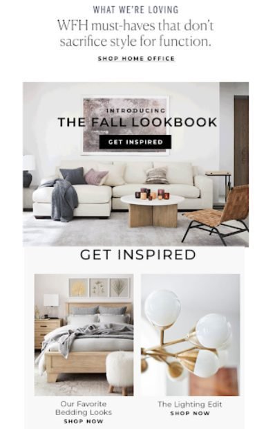
Take a look at the fragment of the promo campaign by Pottery Barn:

It consists of several distinguishable blocks and features several CTA types: underlined text with a link, text with a link, a button with a black background and white text, and a button with transparent background, black text, and black borderline. However, they all look smooth and resonate with the general layout.
Add an icon
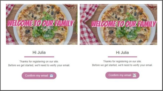
And while we’re on the subject, here is one more way to edit your CTA design. Now, you can add there an icon – an image or GIF. This approach will be especially applicable to actions that can be visually represented. For example, Add to Cart can be paired with a cart icon, Hot Sales with a fire icon, and Call Us with a phone ringing icon.

Note, however, that when adding an icon to the CTA, choose one with a transparent background. Otherwise, it will look rather unprofessional on all buttons but white.
Add a link to an image.
As a rule, CTA buttons are either square or rounded. But if you want a custom design, you can upload an image as a CTA and add a hyperlink to it.
Mind that it’s better to add the already edited image (ready text, color, borders). Although many professional email marketing platforms offer a built-in image editor, it will take you way more time to edit an image CTA than a regular CTA.
Do all the jobs in the visual editor you’re always using to prepare product photos, banners, etc., and then simply upload it to the system and adjust its placement and size. Don’t forget to write the alt text in case the image won’t be displayed in the email client for any reason.
Additionally, make sure this image is responsive, i.e., optimized for mobile marketing. The button should look equally good on both desktops and smartphones. Before launching the campaign, send several test emails to different email clients and open them on different devices: this is a proven way to see your email the way the recipient sees it.
Optimize for Dark Mode.
Dark Mode is an option for mobiles (≧ Android 10 and iOS 13) that allows changing the interface background from light to dark. As a dark theme, It’s available for desktops as well, but it doesn’t always affect the content of the email. However, on the mobile, it’s applied to the message inside, so you might want to ensure your CTA is visible in all modes. There are several ways to do it:
- Don’t use black button text with a transparent background;
- Apply light shadows to black buttons;
- Use contrast button borders;
- Use a colorful background;
- Ally, colorful background to the stripe with the button container.

And my last tip will always be to test emails for broken links, including those added to CTAs, because it’s a big disappointment when you invest so much effort into catching the attention and then can’t convert it simply because something went wrong with your buttons.
So follow the above tips, make your email CTA clear and direct, and place them where people expect to see them, and they’ll benefit your conversion rates.